Ecom21 finance forum identity
A massive and inspiring event of the year in the field of e-commerce that gathers hundreds of internationally successful market makers, opinion-leaders and the most influential experts of the field.
We updated the logo and created the style of the 2017 conference which took place in Riga, Latvia.

Logo
Continuing business spirit from previous years we added colours and created unique ECOM21 lettering.
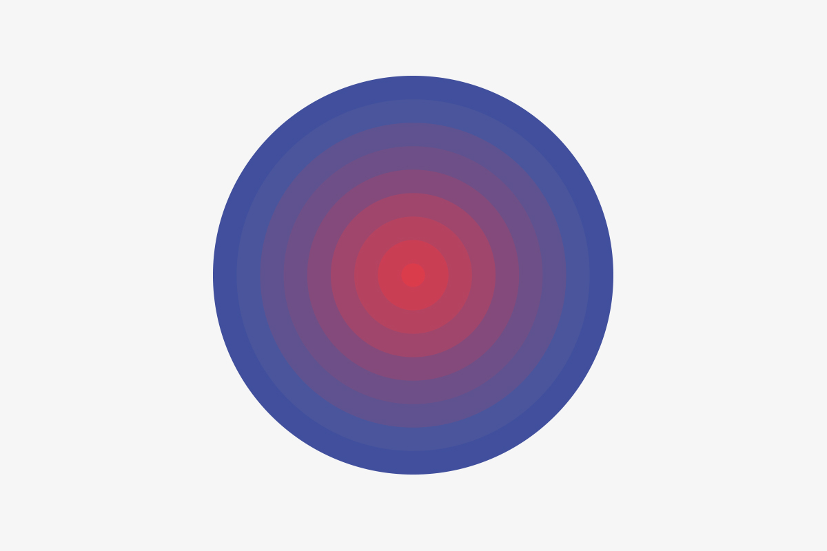
Circles
For accentuating, we have developed animation circles, which graphically represent the main essence of the conference – professional communication and interaction, expansion of business contacts.


Elements
The style was based on the Suisse font from the Swiss company Swiss Typefaces, which has outlined the tone and mood of other elements – the layout, lines and general sterility.


