iRietumu 2.0 ibank interface design

iRietumu 2.0 ibank interface design

Rietumu Bank is one of the largest financial groups in Baltics specializing in provision of services for private and business customers.

The previous version of the internet bank has existed solidly for 7 years. Being a modern bank and willing to keep up with the world latest trends, the bank contacted us in order to create a new visual design for iRietumu. We strived to put emphasis on the functional features of the internet bank and implement state of the art technologies in development.

Welcome screen

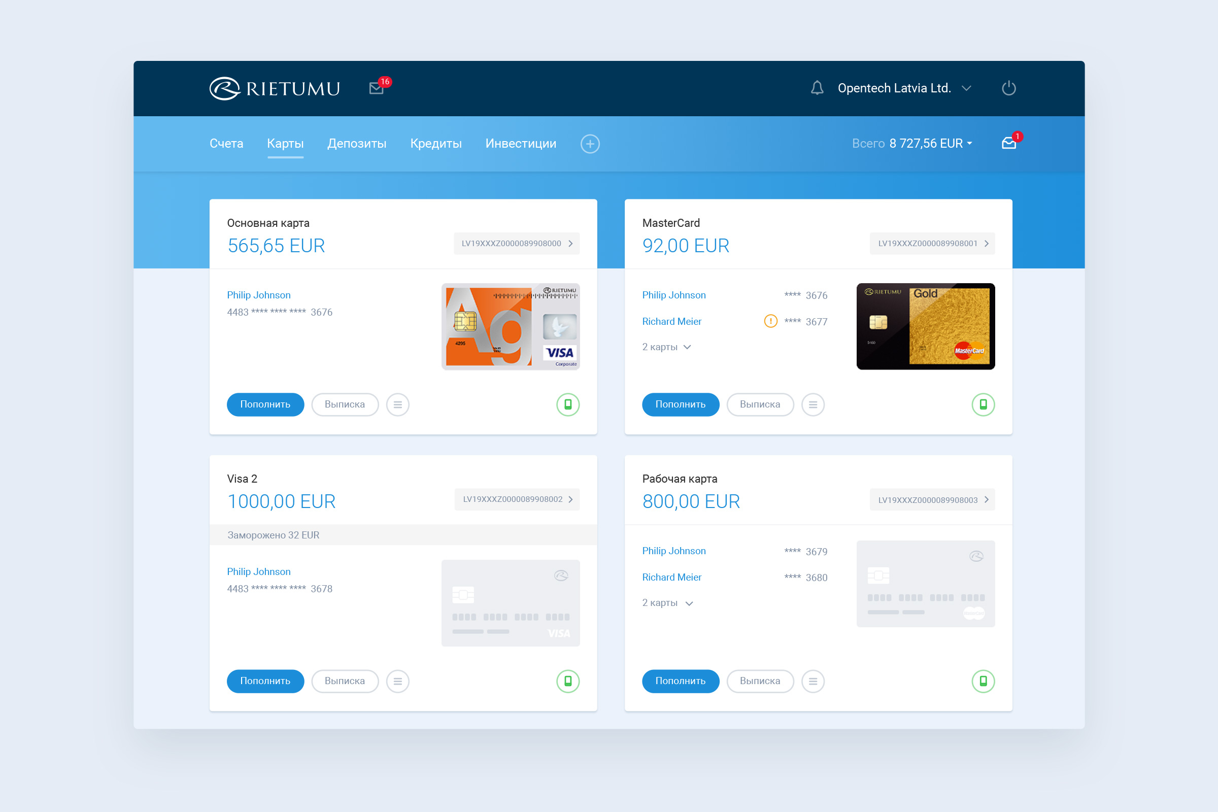
A successfully authorized user is brought to the welcome screen, which holds all user accounts' information in separate cards. Just like in a dashboard, every card includes short operational information and all events related to an account.

The layout
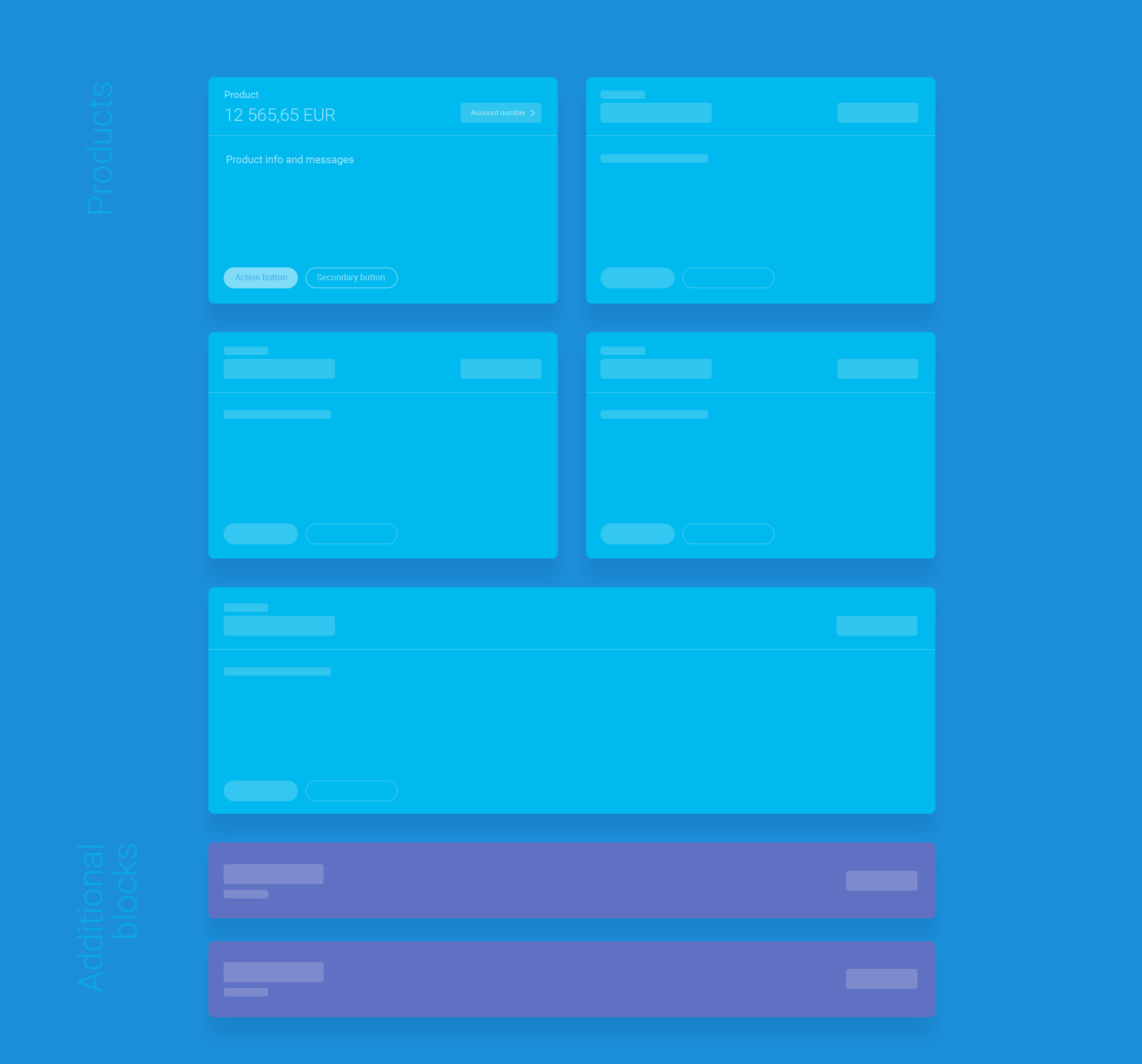
The screen structure consists of rectangle cards that adapt their size according to information they bear. If a client has one account only, the card will fill the entire width of the screen and the information is placed in separate rows.

However, most clients are using multiple accounts, and they are displayed in two parallelly placed cards.

This layout allows placing unlimited number of additional blocks and it will not harm the overall structure of the page.

Cards

Payment cards have their own account numbers, thus it was obvious to display them similarly to accounts. The client can easily read notices on each separate card.
Transactions
The statement, account top up or transactions report - anything can be quickly viewed without having to leave the cards page.

Information is loaded contextually, skipping refreshing the page.
Top up the card
The card account and the client's main account are divided, which provides additional security of the funds. Topping up the card account happens contextually, taking into account the client's preferences.
A special attention was paid to online ordering of the bank's products and services. For example, we had drawn unique information pop-up with the order form for each card.

Payments

One of the cool features of the new internet bank is the dynamic forms of payments and conversions: from a small form of payment between own accounts to an international payment with a chain of correspondent banks.

New payment
Together with the bank, we designed a universal payment form, which transforms as it is getting filled in.
Conversion
Currency conversion calculator shows the result live and offers additional services of fixing the exchange rate and execution date.
While modeling user behaviour scenarios, we prepared more than 200 different screens, which dynamically popping up in the UI.